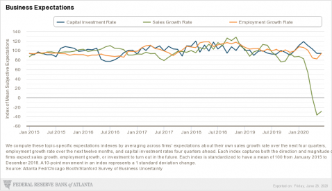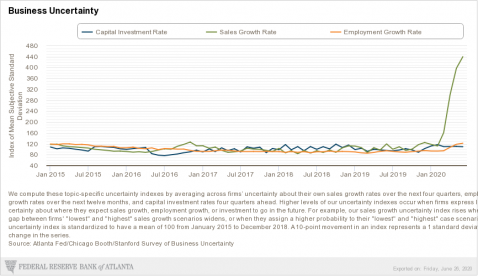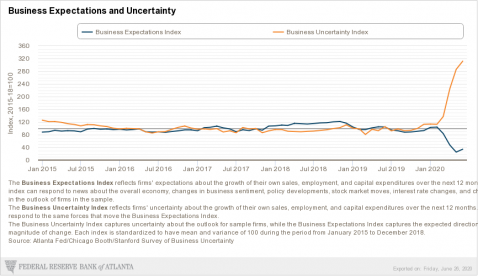


Certainly these could be characterized as the “duh charts” in this environment. Business is obviously down, and uncertainty is up. That is not news. It is nonetheless interesting to see this all graphically represented. It also serves to remind one that that uncertainty means only what it means, not certain. Put differently, it simply means the there is a wider than normal range of potential outcomes, and half of those are better than the median of them.
